Concept Brief
Cynergy Dance is more than a studio—it’s a space where confidence is built, stories are expressed, and movement becomes a form of identity. This redesign translates that feeling into a digital experience, using bold visuals, rhythm-driven layouts, and intentional moments of pause to mirror the flow of dance itself.
Why Cynergy Dance Needs a New Website
Cynergy Dance Company has been shaping dancers and building confidence in San Antonio, Texas since 2003. The current website doesn’t reflect any of that.
Structurally, the site lacks hierarchy and clear flow. Navigation is inconsistently grouped, key actions are buried, and content is scattered in a way that creates friction rather than guidance.
Visually, it reads as an out-of-the-box template with no design intention. Images are low-quality, layouts lack rhythm, and there’s no cohesive visual system anchoring the brand. The homepage — the studio’s first impression — opens flat and forgettable. Nothing says dance.
The redesign aims to close that gap: clear structure, bold visuals, and an experience as intentional as the movement Cynergy teaches every day.
Content Planning
Before any design decisions were made, I focused on collecting and organizing all the content needed for each page.
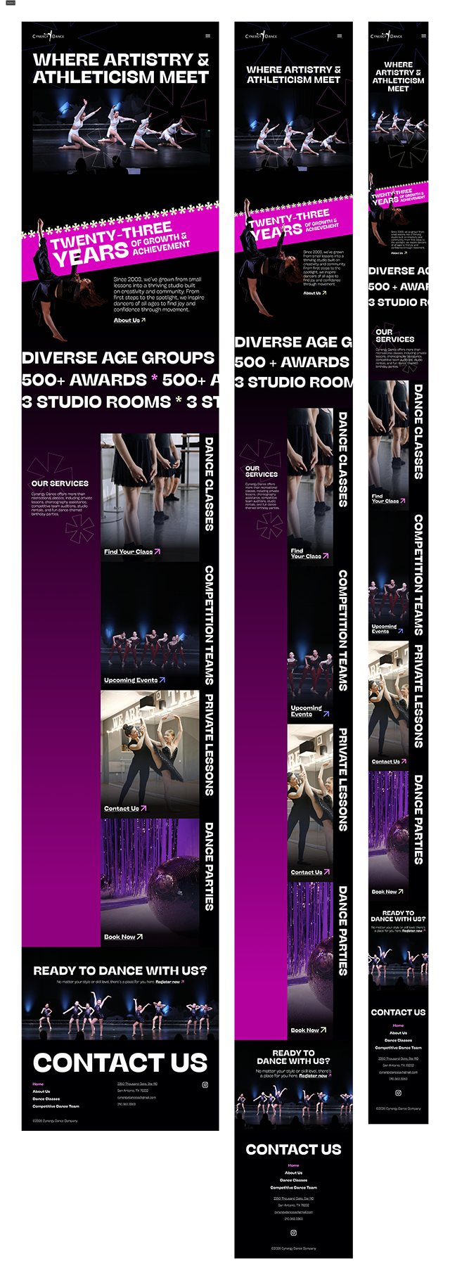
Highlights the studio’s growth over the years, key details like diverse age groups served, 500+ awards won, and 3 studio rooms, along with services including dance classes, private lessons, competitive teams, and dance parties. The page is anchored by a bold hero section, a clear call to action, and a footer.
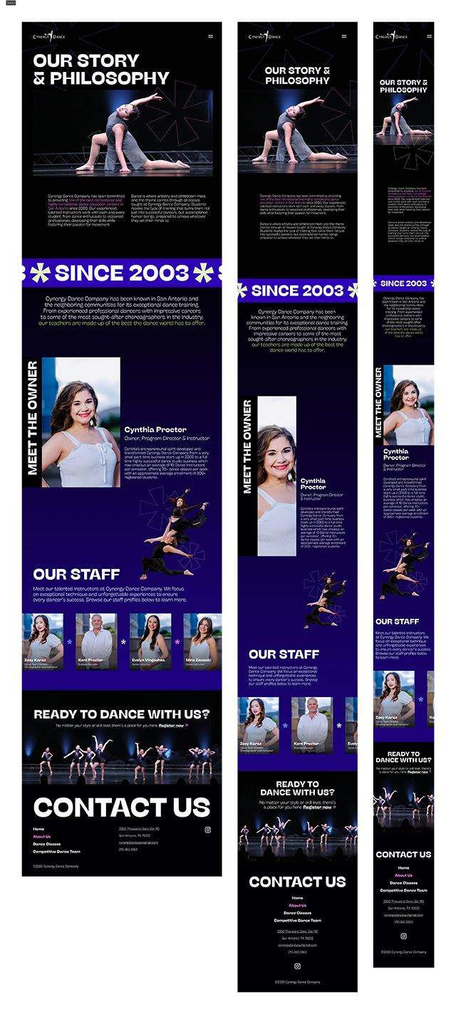
Introduces the studio’s story and philosophy while spotlighting the staff behind it all.
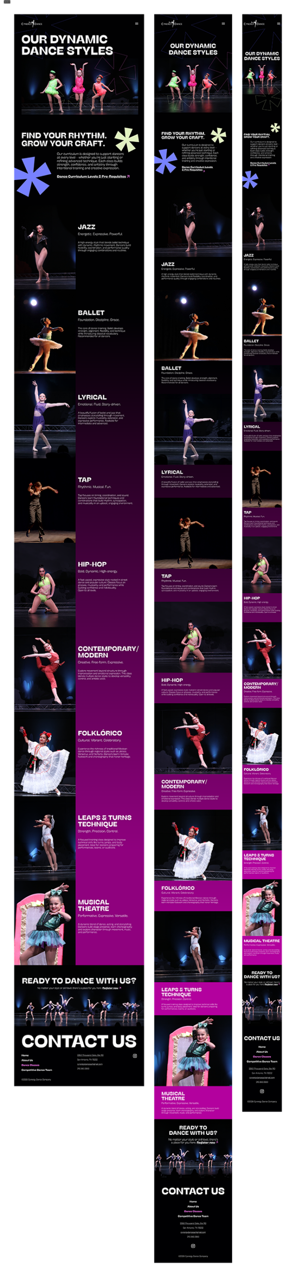
Showcases Cynergy’s full range of dance styles through imagery from competitions and photoshoots, with each section highlighting a unique style to encourage users to discover their rhythm or grow their craft. Includes links to curriculum levels and prerequisites.
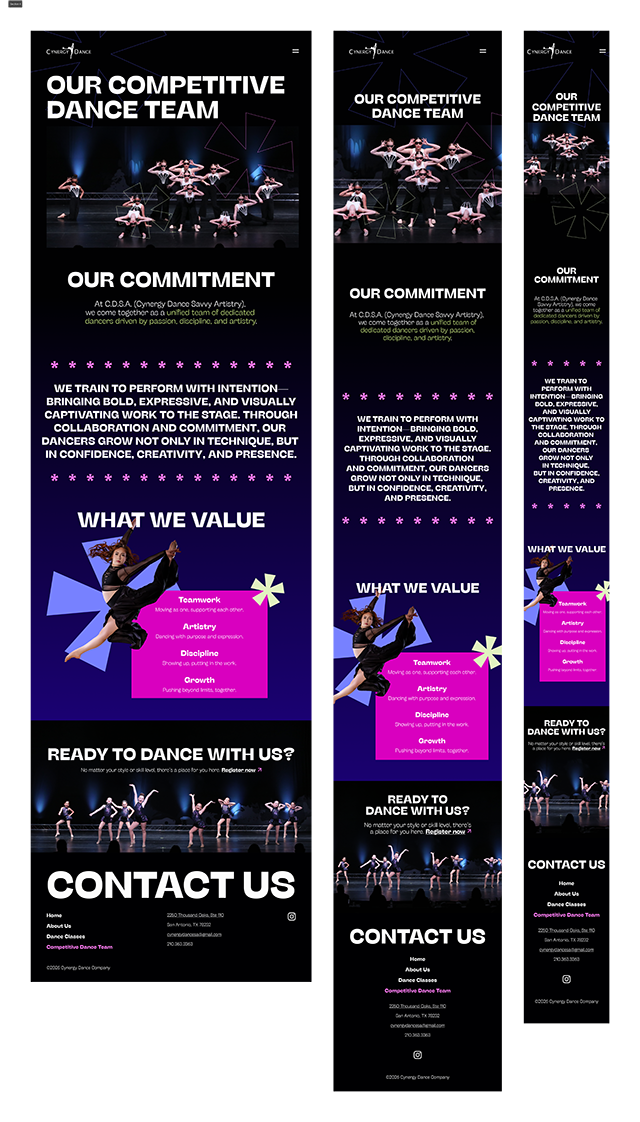
Amplifies the studio’s competitive spirit and the values that drive it.
Wireframing
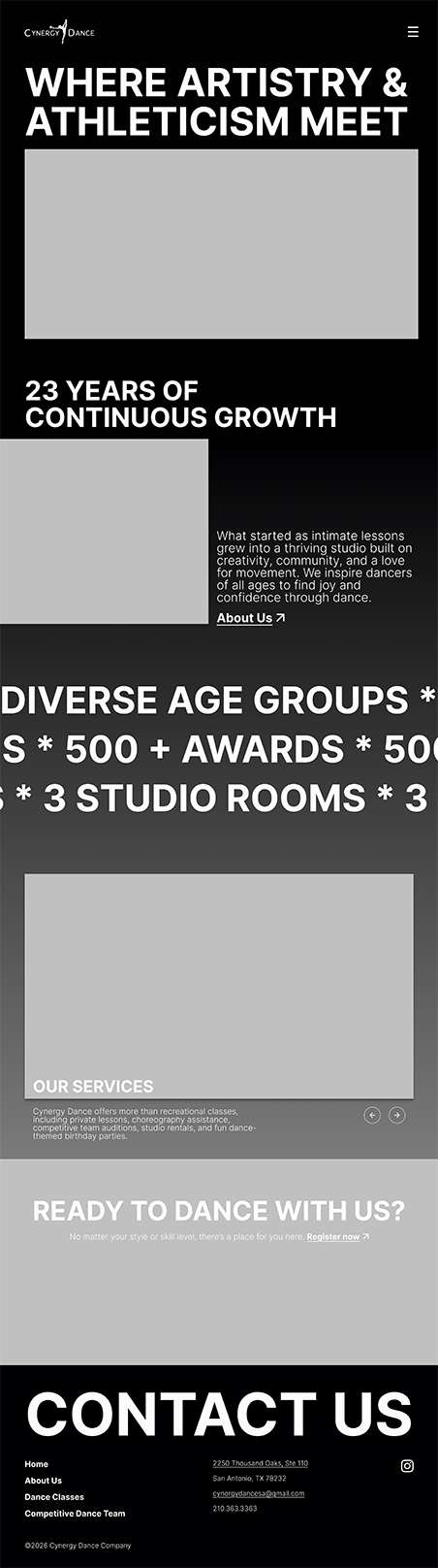
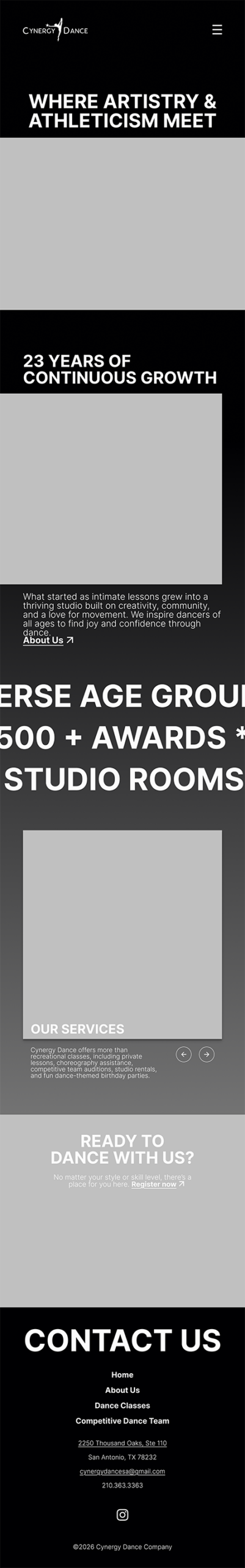
Before committing to any visual direction, I built low-fidelity wireframes for each page across three breakpoints — desktop, tablet, and mobile. The goal was to establish structure and hierarchy first, stripping away color and imagery so every layout decision could be evaluated on its own logic.
What’s Working:
The bold, oversized hero typography immediately sets a different tone.
The two-column split in the “23 Years” section creates visual tension in a good way.
The scrolling marquee ticker for the stats feels kinetic without being distracting.
The footer is clean and well-organized across all three breakpoints.

What’s Not Working:
The services carousel section felt like the weakest moment — a single image with small text underneath didn’t carry the same energy as the rest of the page.
Home
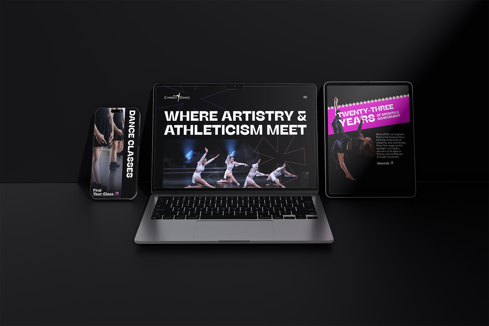
The home page sets the tone immediately — oversized typography, full-bleed performance photography, and a dark, high-contrast palette that feels as bold as the studio itself. A scrolling marquee pulses through the studio’s key stats, keeping the page in constant motion. The services section uses vertical rotated labels alongside imagery to guide users through what Cynergy offers, while a strong CTA closes the page with a clear next step.
About Us
The About page balances story and credibility. A dual-column intro leads with the studio’s philosophy before handing off to the “Since 2003” marquee — a nod to longevity that carries real weight. The owner spotlight is given generous space, followed by a staff grid that puts faces to the instruction. The deep purple section creates a visual shift that signals a change in tone — from story to people.
Dance Classes
This page earns its scroll. Each dance style gets its own moment — a full-bleed photo, a bold style name, a short descriptor, and a brief write-up — creating a rhythm that mirrors the variety of Cynergy’s curriculum. The alternating image-text layout keeps the eye moving, while the magenta accents tie each section back to the brand. A link to curriculum levels and prerequisites gives serious dancers a clear path forward.
Competitive Dance Team
The team page leads with presence. The hero drops users straight into performance photography that communicates the level of seriousness before a single word is read. The commitment statement is set large and loud — almost manifesto-like — and the “What We Value” section distills the team’s identity into four clear pillars: Teamwork, Artistry, Discipline, and Growth. The layout doesn’t explain the team. It amplifies them.
Final Mockups
The designs come to life across device mockups that showcase the full responsive range — from desktop hero moments to mobile-native layouts. Every screen reflects the same visual language: bold typography, high-contrast imagery, and a color palette that feels electric without losing sophistication. What started as a cluttered, template-bound website is now a digital experience that actually moves.
Impact
This redesign gave Cynergy Dance something their original site never had — a presence that matches their reputation. The new site communicates the studio’s identity the moment a user lands on it, guiding them through a clear, intentional journey from first impression to registration.
Parents enrolling their kids, dancers researching styles, competitors sizing up a team — every user now has a path that respects their time and earns their trust. The design doesn’t just represent Cynergy Dance. It reflects what happens inside those studio walls every single day.
Conclusion
Cynergy Dance has spent over two decades building something real — a community, a legacy, and a standard of excellence. This project was about making sure their website finally says the same. Through thoughtful structure, expressive visuals, and a design system built around movement and identity, the redesign closes the gap between who Cynergy Dance is and how the world sees them online.