Concept Brief
Triple Crown Reserve & Co. is a concept bourbon brand inspired by the prestige of the Kentucky Derby, Preakness Stakes, and Belmont Stakes. The packaging and web design translate the elegance and competitive spirit of the Triple Crown into a refined, cohesive brand experience rooted in heritage storytelling, craftsmanship, and elevated digital presentation.
Awards: Salute 2025 Merit Award
Issued by the UCO School of Design
Building a Visual System Rooted in Racing Heritage
The Triple Crown of American Horse Racing carries over 150 years of history, tradition, and spectacle — none of which I knew going in. My challenge wasn’t just designing a cohesive label system for a bourbon brand; it was first understanding the world I was designing for.
Before a single layout came together, I had to immerse myself in the lore of the Kentucky Derby, the Preakness Stakes, and the Belmont Park — the venues, the iconic winners, the visual language that makes each race distinct — so that the final system felt genuinely rooted in that heritage rather than just aesthetically inspired by it.
This top-down view shows how the crown seals unifies the three bottles into one cohesive system. Strategic color differentiates each whiskey while preserving a refined, consistent identity rooted in heritage and craftsmanship.
This top-down view shows how the crown seals unifies the three bottles into one cohesive system. Strategic color differentiates each whiskey while preserving a refined, consistent identity rooted in heritage and craftsmanship.
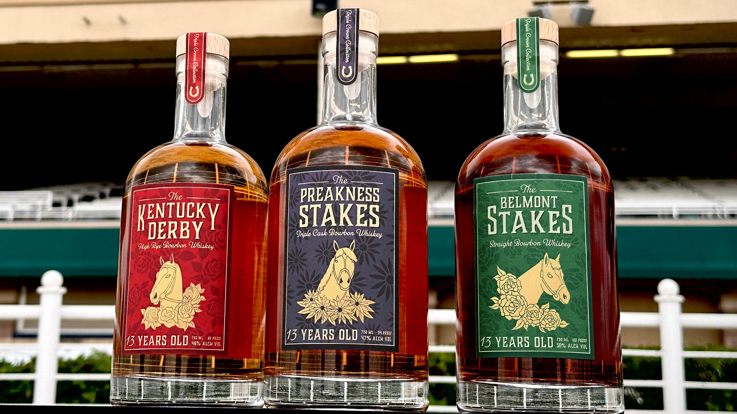
Each label is color-coded to its race — deep red for the Kentucky Derby, dark gray for the Preakness Stakes, and forest green for the Belmont Stakes — with each winner’s flower woven into the design: roses, black-eyed susans, and white carnations respectively.
At the center of each is a portrait of a legendary champion: Sir Barton, the very first Triple Crown winner; Secretariat, the most celebrated racehorse in history; and Affirmed, whose 1978 sweep earned him over $2 million and a permanent place in racing lore.
Beyond the Bottles
Extending the brand beyond the bottle meant building a digital experience that could hold the same weight as the labels — rich in history, deliberate in detail, and visually cohesive across every screen. The challenge was designing a platform that could speak to two distinct audiences at once: whiskey enthusiasts drawn to the craft and the flavor, and horse racing fans drawn to the lore and the legacy.
The site needed to feel as considered as the product itself. The dark, moody palette established on the labels carried over into the hero and navigation, while lighter sections gave the content room to breathe. Each page serves a different layer of the brand story — from the distillation process and bottle lineup to cocktail recipes and food pairings — without losing the throughline of heritage and craftsmanship that ties it all together.
Designed for Every Screen
Designing for multiple device sizes added another layer of intention to the process. What reads as sweeping and cinematic on a desktop monitor had to remain elegant and navigable on a phone. The result is a responsive experience that doesn’t just scale — it adapts, keeping the brand feeling premium at every breakpoint.
Explore the Collection: https://triplecrown.savvyplumas.com/